[FR] L'abbaye de Royaucourt est un ancien monastère cistercien construit au XIIe siècle. Elle abrite depuis 1964 la Fondation Royaucourt, dont le cinquantième anniversaire sera célébré en 2014. Au-delà du caractère symbolique de ce changement au moment du bilan et de la projection dans l’avenir, Royaucourt souhaite que la visibilité offerte par cet événement majeur profite à l’installation de la marque et de l’identité visuelle. Voici le projet que nous avons présenté.
[EN] Royaucourt Abbey is a former Cistercian monastery built in the twelfth century. Since 1964 it houses the Royaucourt Foundation, whose fiftieth anniversary will be celebrated in 2014 Beyond the symbolic nature of this change at the time of assessment and projection into the future, Royaucourt wants the visibility provided by this major event benefits the installation of the brand and visual identity. Here is the project we presented.
[FR] Le concept
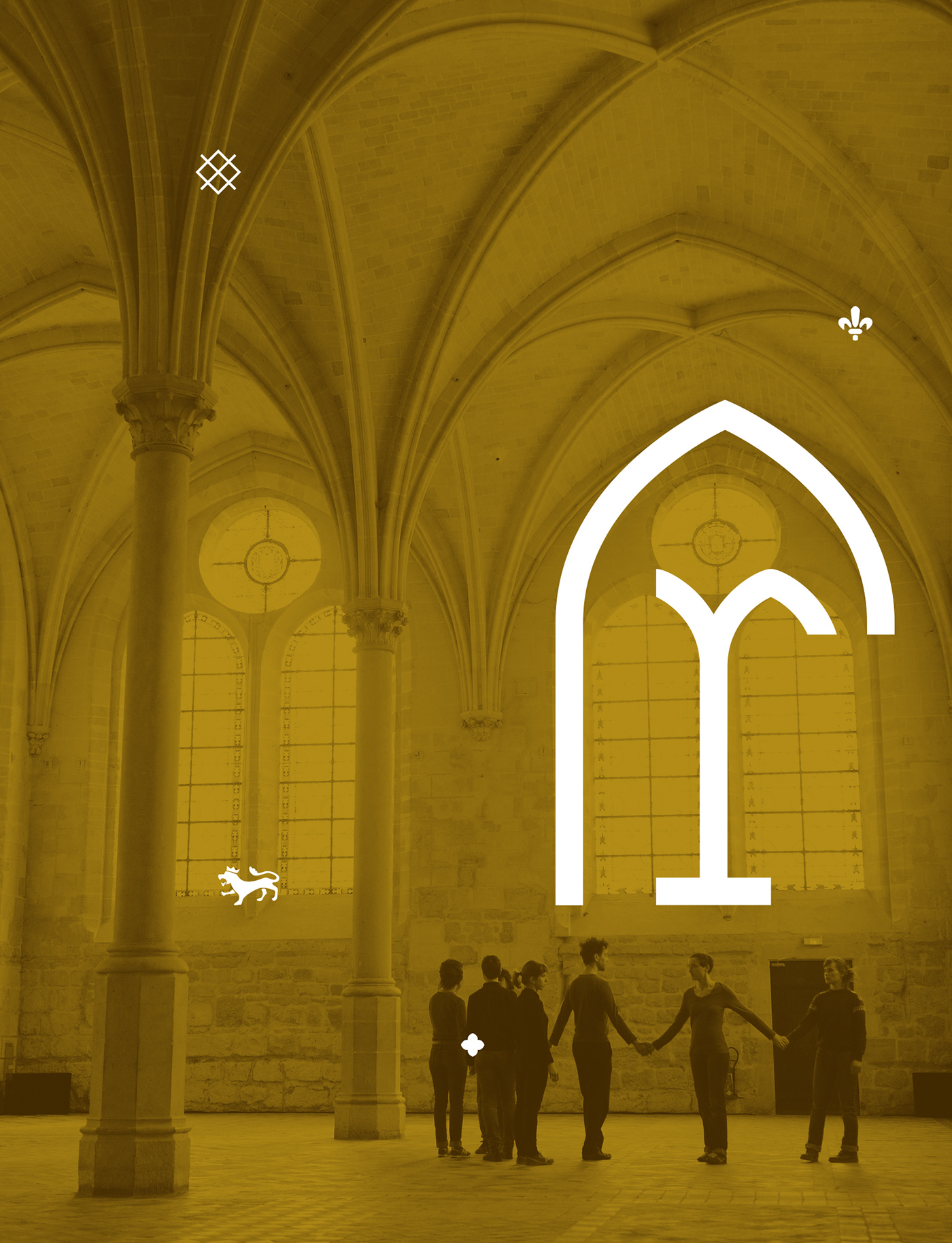
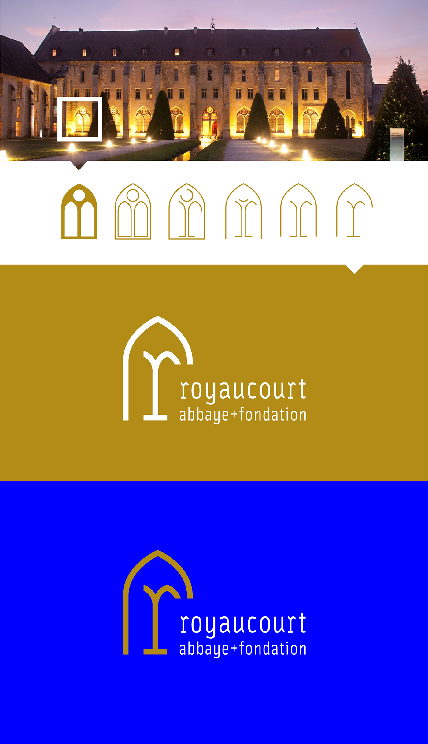
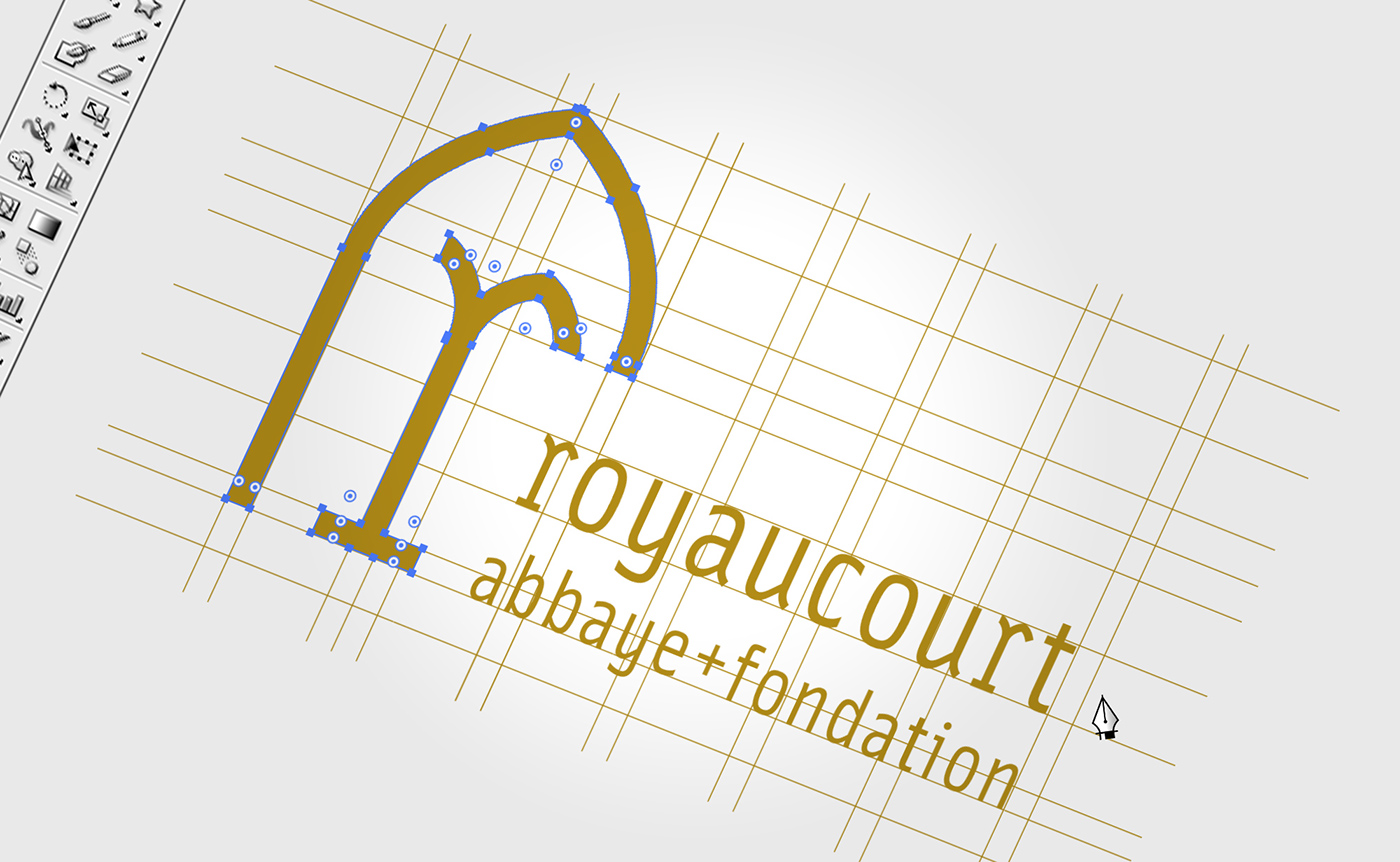
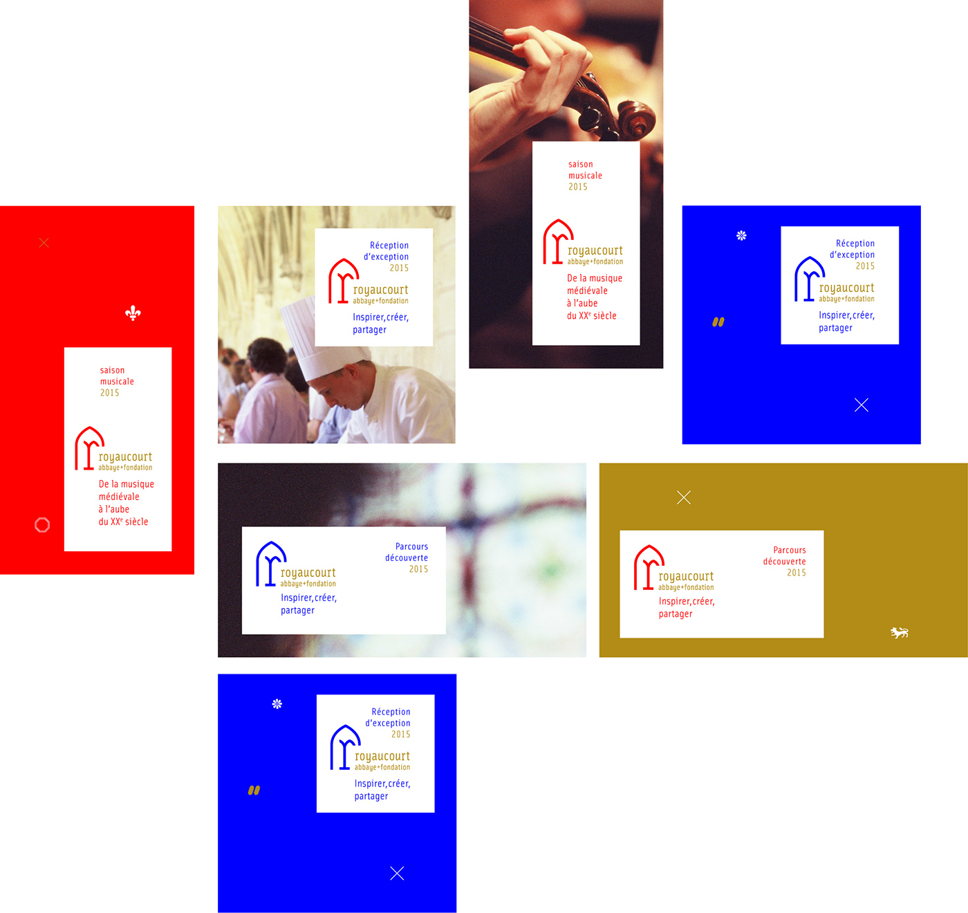
Nous proposons de créer un signe fortement évocateur du lieu et de l’esprit qui l’anime. Nous sommes donc partis d’un élément architectural incontournable dans ce bâtiment : les fenêtres en ogives.
Nous proposons de créer un signe fortement évocateur du lieu et de l’esprit qui l’anime. Nous sommes donc partis d’un élément architectural incontournable dans ce bâtiment : les fenêtres en ogives.
Les fenêtres : Elles jouent un rôle essentiel dans la vie quotidienne, tant individuelle que sociale : elle est source de luminosité, de visibilité, de communication, en même temps que frontière entre deux espaces mitoyens souvent antithétiques, entre introspection et ouverture sur le monde.
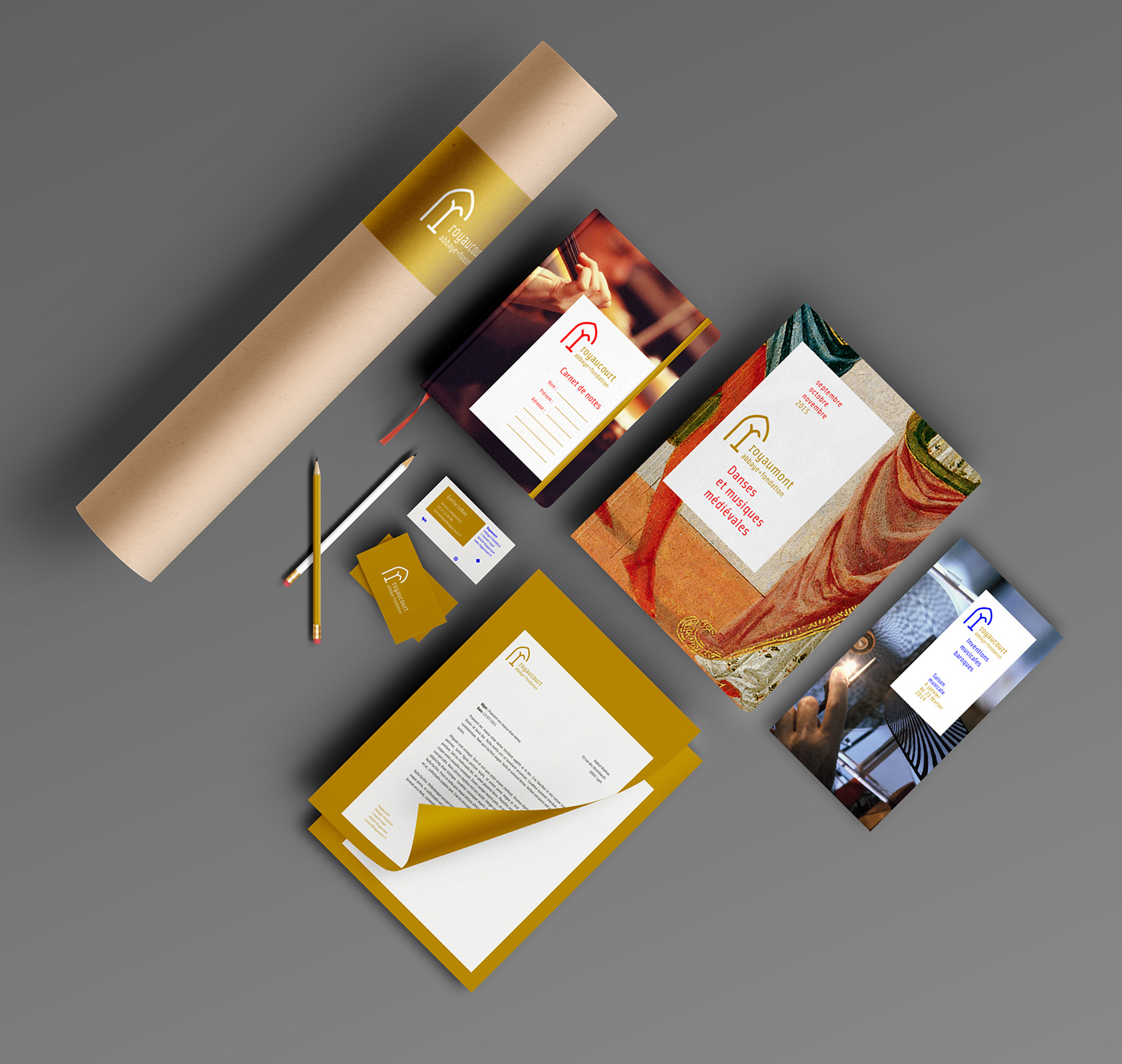
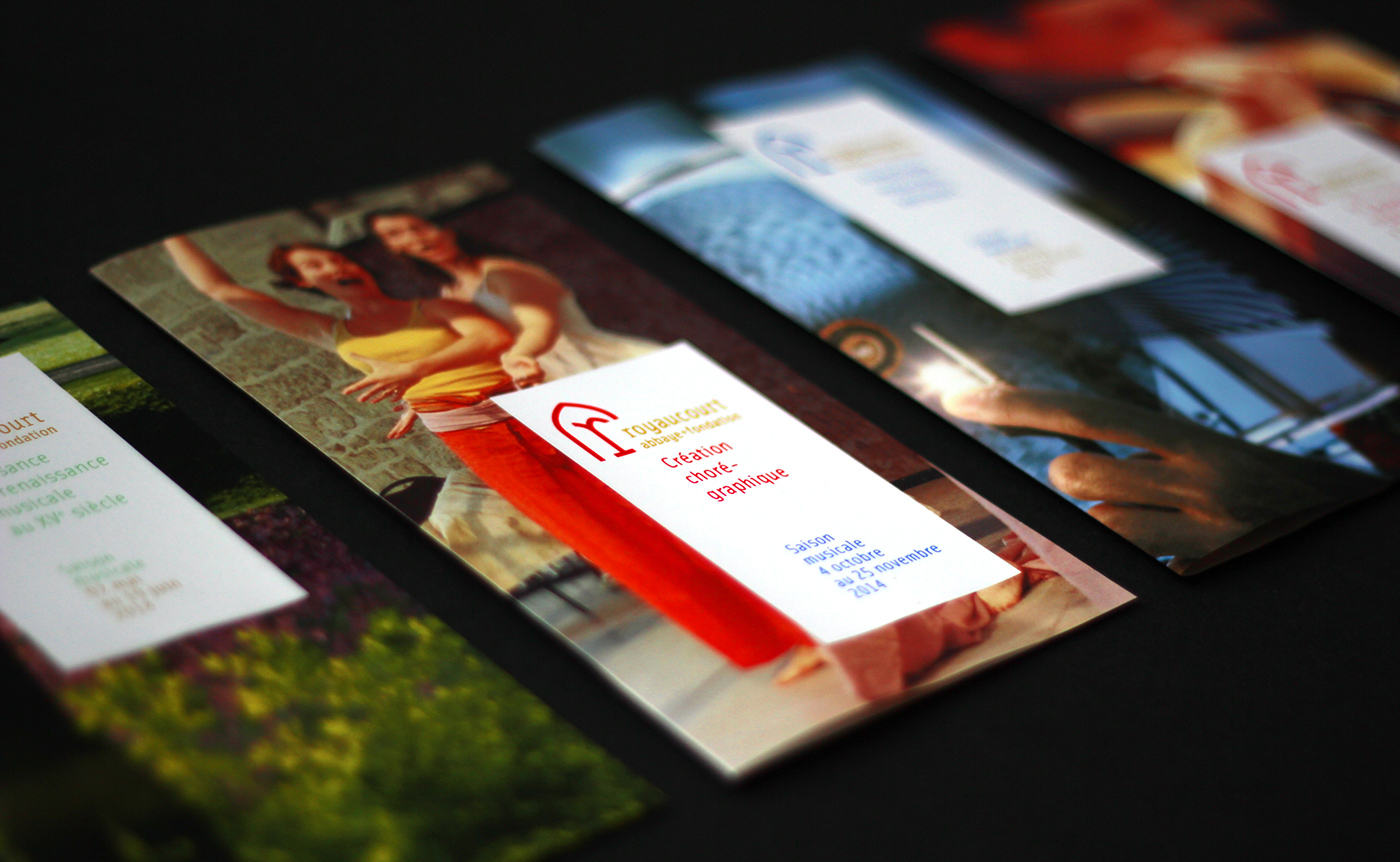
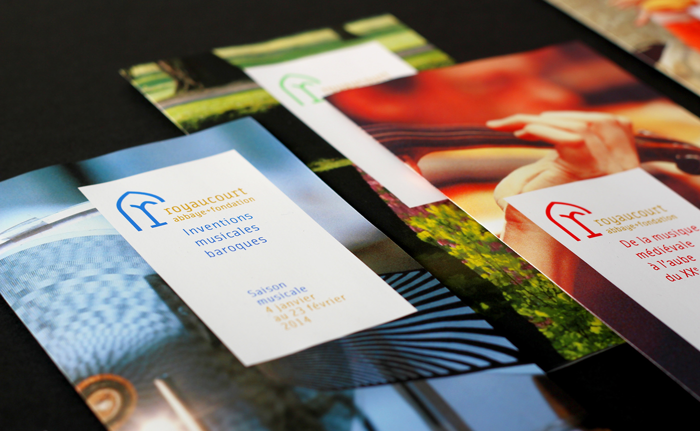
La couleur : Nous proposons d’utiliser une couleur «or» afin de signifier l’origine royale de l’abbaye.
La lettrine : Déjà au Moyen Âge, les moines utilisaient des lettrines dans leurs ouvrages. Le fait d’agrandir et de décorer la première lettre d’un texte donne en effet un certain caractère et de l’animation au sein des écrits. Nous proposons d'utiliser le logo comme une lettrine, autant dans sa composition que dans son utilisation. Une technique d’embellissement efficace à une époque où les images étaient complexes à créer et surtout à reproduire. Mais elle avait une utilité très concrète, une étude a démontré qu’une lettrine augmentait sensiblement l’envie de lire un texte, un avantage indéniable lorsqu’il s’agit d’une marque.
[EN] The concept
We propose to create a highly suggestive sign of the place and the spirit behind it. We started with a key architectural element in this building: windows warheads.
The windows :They play an essential role in everyday life, both individual and social: it is a source of light, visibility, communication, along with two adjoining border areas often antithetical between introspection and openness to the world.
The color : We propose to use a color "gold" to signify the royal origin of the abbey.
The initial letter : Since the Middle Ages, monks used the initials in their works. The fact expand and decorate the first letter of a text indeed gives a certain character and animation within written. We propose to use the logo as a drop cap, both in its composition and in its use. An effective at a time when the images were complex to create and especially to reproduce embellishment technique. But she had a very practical use, a study showed that a drop cap significantly increased the desire to read a text, a distinct advantage when it comes to a brand.

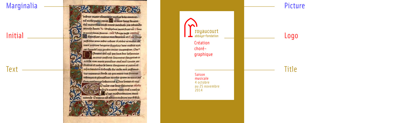
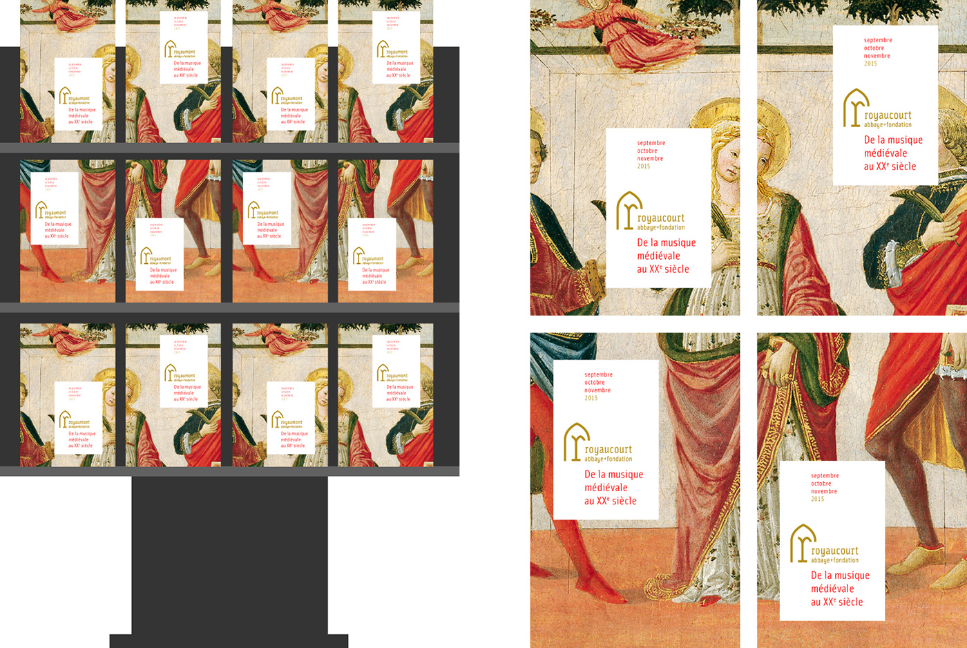
[EN] Principe de composition : "Les marginalias"
Les marginalias sont les enluminures en marge d’une page d’un codex ou d’un manuscrit.
Nous proposons de reprendre cet art de la marge comme principe conducteur des compositions.
[EN] Principle of composition : "The marginalias"
Marginalias are the illuminations on the margins of a page of a codex or manuscript.
We propose to take this art margin as principle conductor compositions.
Marginalias are the illuminations on the margins of a page of a codex or manuscript.
We propose to take this art margin as principle conductor compositions.
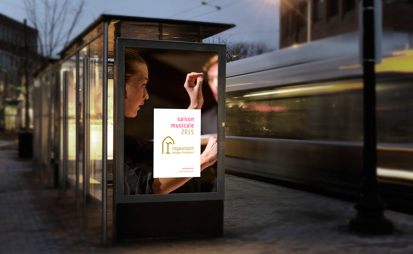
Crédit photo : Michel Chassat
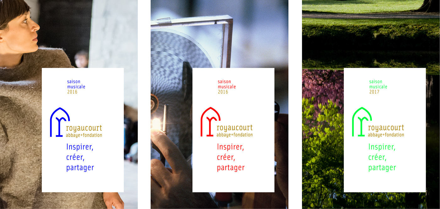
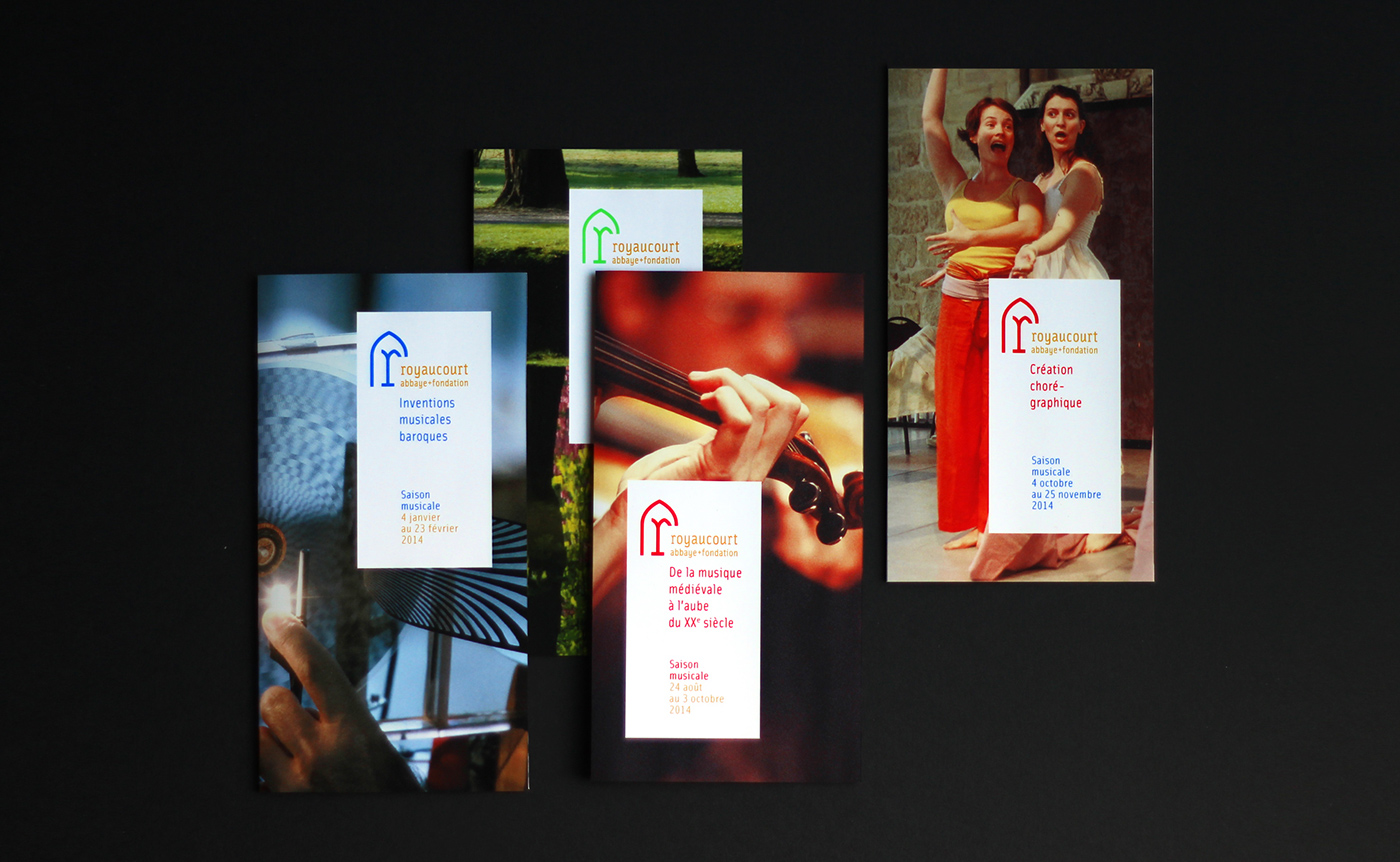
[FR] Une histoire d’amalgame
En utilisant le principe de recadrage précédemment exposé, nous avons proposé de pousser le concept au maximum. Plutôt que de reproduire de manière stérile la même image à chaque fois, nous proposons d’utiliser les possibilités offertes par l’impression en amalgame afin de proposer une série de visuels. La succession de recadrage d’une même image produirait une nouvelle forme de narration inédite, une sorte de reformulation poétique d’une même histoire.
[EN] A story of amalgam
Using the principle crop discussed above, we proposed to push the concept to the fullest. Rather than replicate sterile the same image each time, we propose to use the opportunities offered by printing amalgam to propose a series of visuals. Succession crop of the same image would produce a new form of storytelling unique, a kind of poetic reformulation of the same story.
Using the principle crop discussed above, we proposed to push the concept to the fullest. Rather than replicate sterile the same image each time, we propose to use the opportunities offered by printing amalgam to propose a series of visuals. Succession crop of the same image would produce a new form of storytelling unique, a kind of poetic reformulation of the same story.
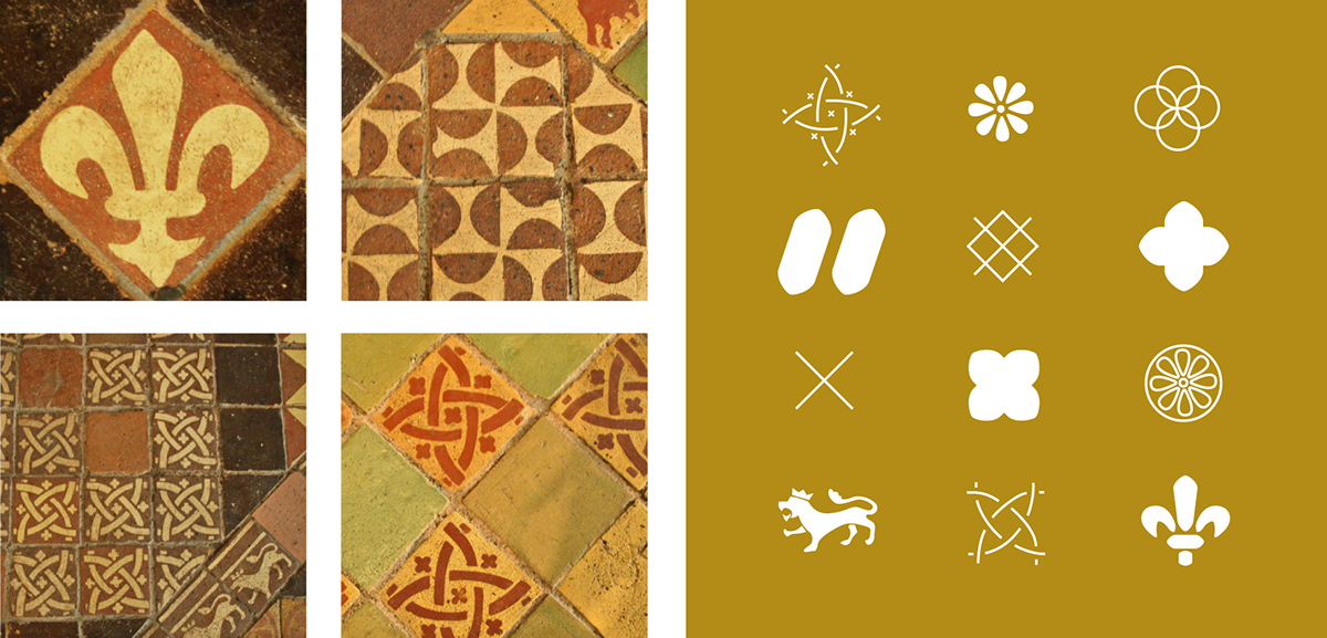
[FR] Création d’une banque d’éléments graphiques
Après un recensement des multiples éléments graphiques présents dans l’abbaye, nous proposons de constituer un répertoire de formes, de motifs qui pourront venir enrichir la charte graphique.
Après un recensement des multiples éléments graphiques présents dans l’abbaye, nous proposons de constituer un répertoire de formes, de motifs qui pourront venir enrichir la charte graphique.
[EN] Creating a library of graphic elements
After a survey of multiple present in the abbey graphics, we propose to develop a repertoire of shapes, patterns that can enrich the graphic.